Styled Component 사용하기
📝 개요
- React, Vue, Angular와 같은 라이브러리, 프레임워크가 인기를 끌면서 재활용 가능한 컴포넌트 기반 개발이 주류가 되고 있다. 여러 컴포넌트로 분리하고, 각 컴포넌트에 HTML, CSS, JavaScript를 모두 담는 코드를 많이 사용하고 있다. React는 이미 JSX를 통해 HTML을 포함하고 있고, Styled Component 라이브러리를 사용하여 CSS를 JavaScript에 삽입할 수 있다.
설치
To download styled-components run => npm install --save styled-components

SASS는 불충분?
- CSS 클래스명에 대한 고민 문제
- 가이드가 없으면 복잡해지는 구조
- 방대한 스타일 정보로 인한 스크롤 지옥
- CSS 클래스 조건부 스타일링
- 동적인 변화 표현에 한계
그렇다고 Inline Style을 사용하자니 우선순위의 문제, HTML 파일의 부피 증가, CSS 역할 분리가 모호함, media query, key frame, Pseudo selector 사용 불가 등의 문제가 있다.
Styled-components
- CSS in JavaScript 기술로, JavaScript내에 CSS를 작성하는 라이브러리
- 스타일 정의를 CSS파일이 아닌 JavaScript로 작성된 컴포넌트에 바로 삽입하는 스타일 기법
- 클래스명을 해시값으로 자동 생성하고, 클래스명 오염을 방지할 수 있음
- 자바스크립트의 동적인 값들을 온전하게 사용이 가능
사용법 살펴보기
1. styled-component 작성 방법
// Getting Started

import styled from 'styled-components'

return (
	<Wrapper>
    	<Title>
        	Hello World!
        </Title>
    </Wrapper>
);

const Wrapper = styled.section`
	padding: 4em;
    background: papayawhip;
`;

const Title = styled.h1`
	font-size: 1.5em;
    text-align: center;
    color: palevioletred;
`;- 코드 가독성을 위해서 컴포넌트를 먼저 선언하고 하단에 styled-component 작성한다.
- Template Literal을 사용하여 작성하며,
const 컴포넌트명 = styled.태그명으로 이루어져 있다.
2.1 styled-component에 props 사용 및 조건식 사용하기
// Adapting based on props

return(
	<div>
    	<Button>Normal</Button>
        <Button width="100">Primary</Button>
    </div>
);

const Button = styled.button`
	background: ${props => props.width < 200 ? "palevioletred" : "white"};
    color: ${props => props.primary ? "white" : "palevioletred"};
    font-size: 1em;
    margin: 1em;
    ...
`;- Button의 props인 width가 200보다 작으면 'palevioletred'색을, 크다면 'white'색을 배경으로 지정한다.
- 변수에 따라서 스타일을 바꿀 수 있는 장점이 있다.
&&,||연산자를 이용해서 스타일을 적용할 수 있다.
${props => props.huge && css`
  width: 10rem;
  height: 10rem;
`}
→ component에 huge가 있으면 mixin css 스타일을 적용하도록 함 (mixin은 4번에서 확인할 수 있다)
2.2 심화
return (
    <ExampleWrap active={email.length}>
      <Button>Hello</Button>
      <NewButton color="blue">Im new Button</NewButton>
    </ExampleWrap>
);

const ExampleWrap = styled.div`
  background: ${({ active }) => {
    if (active) {
      return "white";
    }
    return "#eee";
  }};
  color: black;
`;

const Button = styled.button`
  width: 200px;
  padding: 30px;
`;
3. 생성한 styled-component 재사용하기
// Extending Styles

return(
	<div>
    	<Button>Normal Button</Button>
        <TomatoAnchorButton>Tomato Button</TomatoAnchorButton>
    </div>
);

const Button = styled.div`
	color: palevioletred;
    font-size: 1em;
    margin: 1em;
    padding: 0.25em 1em;
    border: 2px solid palevioletred;
    border-radius: 3px;
`;

// Button의 속성을 상속 받아 새로운 anchor 태그 생성
const TomatoAnchorButton = styled(Button.withComponent("a"))`
	color: tomato;
    border-color: tomato;
`;- 스타일 상속 :
const 컴포넌트명 = styled(스타일컴포넌트명)
4. Mixin css props
import styled, { css } from "styled-components"; // css 사용!

const FlexCenter = css`
	display: flex;
    justify-content: center;
    align-items: center;
`;

const FlexBox = div`
	${FlexCenter}
`;

const RingVariant = (radius, stroke = "10") => css`
  position: absolute;
  border-radius: 50%;
  height: ${radius * 2}px;
  width: ${radius * 2}px;
  border: ${stroke}px solid rgba(0, 0, 0, 0.5);
`;- styled-component는 자주 사용하는 css를 관리하기 위해 css props를 사용한다.
5. 전역 스타일 적용
컴포넌트 단위로 스타일을 작성하면 전역 스타일을 적용하는 방법에 대해서 고민해야 한다. 기존 SCSS에서 reset.scss, common.scss, variables.scss를 만들어서 사용했었다. 그렇다면 styled-component는 reset, common, variables를 어떻게 작성할까?

styled-component는 GlobalStyle과 ThemeProvider를 사용하여 전역으로 사용할 요소들을 쉽게 정의할 수 있다. src > styles 디렉토리에 GlobalStyles.js 파일을 생성하였으며, 아래와 같은 양식으로 작성한다.
import { createGlobalStyle } from 'styled-components';
import reset from 'styled-reset';

const GlobalStyle = createGlobalStyle`
  ${reset}

	// 전역스타일

`;

export default GlobalStyle;
이후에 GlobalStyles.js를 사용하기 위해서 index.js에 아래와 같이 작성했다. import GlobalStyle from './styles/GlobalStyles';를 작성하고 <GlobalStyle />컴포넌트를 사용했다.

추가로 src > styles 디렉토리 내에 Theme.js 파일을 생성하여 아래와 같은 코드를 작성했고, 마찬가지로 index.js에서 import하여 <ThemeProvider theme={theme}>로 사용했다.
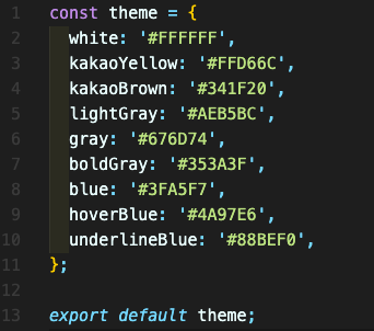
상단의 theme을 사용하기 위해서는 아래와 같은 코드를 입력한다.
const Container = styled.div`
	background-color: ${props => props.theme.kakaoYellow}
`;
'⭐️ Markdown & Style sheet > CSS' 카테고리의 다른 글
| [CSS] CSS 선언 방식 (0) | 2023.09.21 |
|---|---|
| [CSS] 구조 및 특징 이해 (0) | 2023.09.21 |
| Sass(SCSS) 적용하기 (0) | 2022.05.12 |
| CSS display - block, inline-block, inline 이해하기 (0) | 2022.04.27 |
| CSS position - static, relative, absolute, fixed 이해하기 (0) | 2022.04.27 |